
Pixel-perfect layouts on
every screen size
Mobile first designs that look and function flawlessly across smartphones, tablets, laptops, and large desktops, every breakpoint tested and perfected.
One design, flawless on
every device.
Over 60% of your visitors are on mobile, every layout we design is built mobile first and scales up cleanly to tablet and desktop without losing impact.

Cross Device Layouts
Every page is designed to adapt fluidly across smartphones, tablets, laptops, and large desktops, with layouts, type, and spacing tuned for each breakpoint.

Breakpoint Optimisation
Custom breakpoints designed around your content, not generic device sizes, so layouts never feel cramped or stretched.
Touch-Friendly Navigation
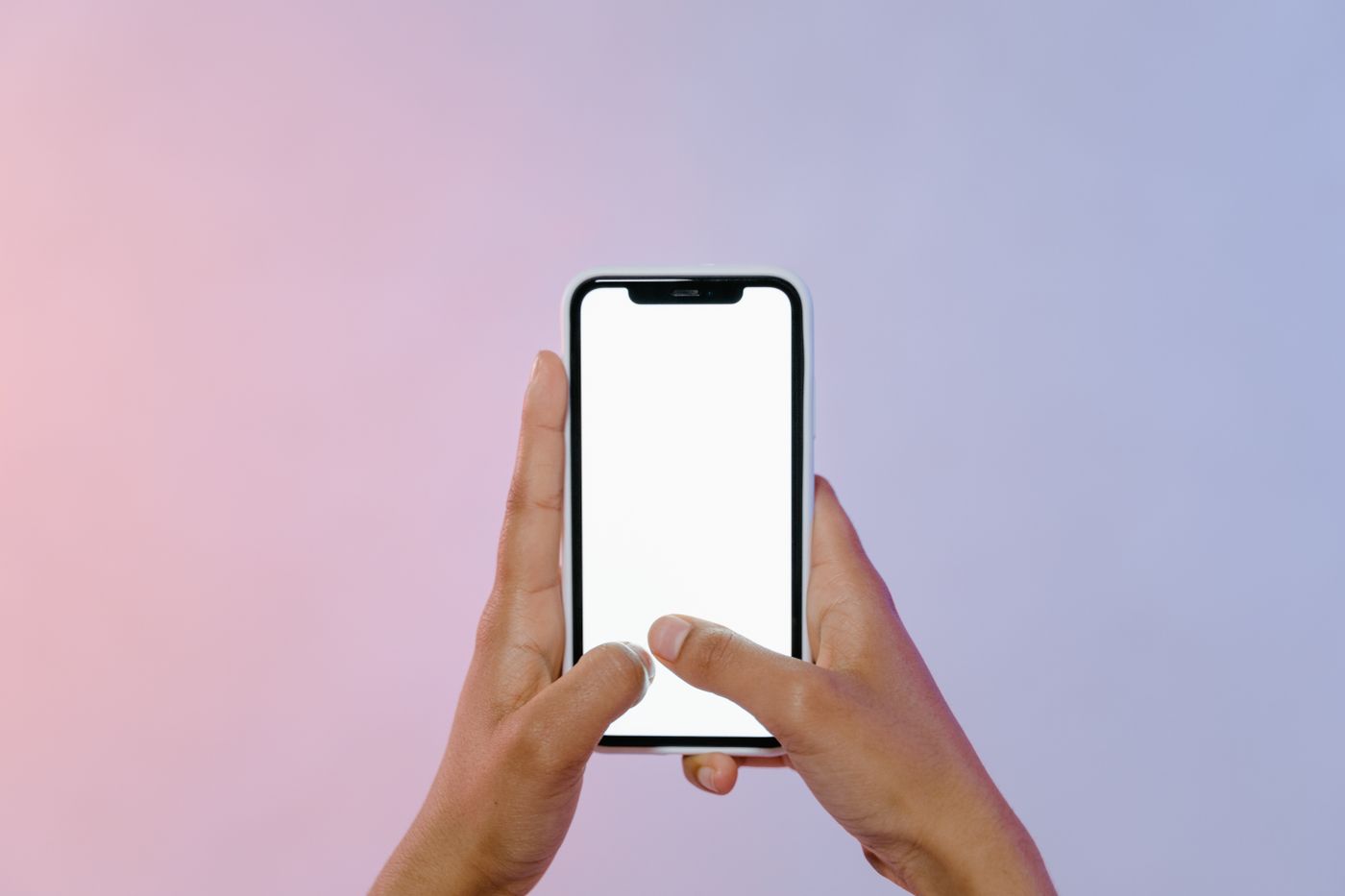
Mobile menus, buttons, and forms sized and spaced for real thumbs, no accidental taps, no frustrating pinch-to-zoom.

Performance-Optimised Assets
Responsive images and lazy loading so mobile visitors get a fast experience even on slower connections.
Cross-Browser & Device QA
Tested on real iOS, Android, and desktop browsers, not just emulators, to catch layout issues before launch.
Designed for mobile, perfected everywhere
We start every design on the smallest screen and scale up, ensuring no feature or content is ever an afterthought on mobile.
Mobile-First Approach
Every design starts on mobile and scales up beautifully, because over 60% of your visitors are on a smartphone.
Every Breakpoint Tested
From 320px phones to 4K monitors, layouts are checked at every major breakpoint, not just two or three.
Performance Optimised
Responsive doesn't mean heavy, optimised images and minimal code keep mobile load times fast.
100% Custom, No Templates
Every layout is built from scratch to fit your content, never a generic responsive template.
A structured responsive design process, mobile to desktop
A clear, collaborative process ensures your design works flawlessly on every device before it ever reaches your users.

Mobile, Tablet, Desktop, Test
Design the smallest screen experience first
We start with the mobile layout to ensure every core feature and piece of content works on the smallest screens.
Expand the layout for larger screens
Layouts are adapted for tablet and desktop, using the extra space to enhance, not just stretch, the design.
Develop with fluid grids and flexible assets
Responsive code built with fluid grids, flexible images, and CSS breakpoints matched exactly to the design.
Test on real devices before launch
Final testing across real iOS, Android, and desktop browsers to catch any layout issues before going live.
Responsive Design, Frequently Asked Questions
Answers to the questions US & UK clients ask us most.
What is responsive web design and why does it matter?
Responsive design means your website automatically adapts its layout, images, and text to fit any screen size, from a small smartphone to a large desktop monitor. Since over 60% of visitors browse on mobile, a site that isn't responsive loses visitors, conversions, and search rankings.
Which devices and browsers do you actually test on?
We test on real iOS, Android, and desktop browsers, not just emulators, to catch layout issues emulators often miss. Every major breakpoint is checked, from 320px phones up to 4K monitors, not just two or three common sizes.
What are breakpoints and how do you decide where to place them?
Breakpoints are the screen widths where a layout shifts to a new arrangement. Rather than using generic device sizes, we design custom breakpoints around your actual content, so layouts never feel cramped on one screen or oddly stretched on another.
Does responsive design affect SEO and Google rankings?
Yes. Google uses mobile-first indexing, meaning it primarily evaluates the mobile version of your site for ranking. A responsive site that performs well on mobile, with fast load times and a usable layout, directly supports better search visibility and conversions.
Will responsive design slow down my website on mobile?
No, done correctly, it's the opposite. We pair responsive layouts with optimised, responsive images and lazy loading, so mobile visitors get a fast experience even on slower connections, rather than downloading a full desktop-sized page on a phone.